UX/UI CASE STUDY : FEDERAL TRADE COMMISSION WEBSITE & APP
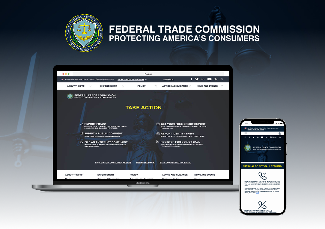
The Federal Trade Commission (FTC) is an independent U.S. government agency dedicated to protecting consumers and promoting fair competition. The agency enforces federal consumer protection and civil antitrust laws, working to prevent deceptive business practices, fraud, and anti-competitive behavior. As one of the nation's primary consumer advocacy organizations, the FTC provides resources, investigates complaints, and develops policies that help create a safer and more transparent marketplace. This project focused on improving the digital experience for users seeking trusted information and government services through the FTC's online platforms.
PROJECT OVERVIEW
PROJECT SCOPE
This project focused on the redesign of the Federal Trade Commission (FTC) website and the creation of a companion mobile application
TOOLS
Figma, Miro, Google Slides, & Google Drive
ROLE
UX/UI Designer (Research, Visual Design, Interaction Design, User Testing)
TEAM
Joi Addison (Individual Project) with feedback from the mentor and peers
DURATION
2 Weeks
PROBLEM
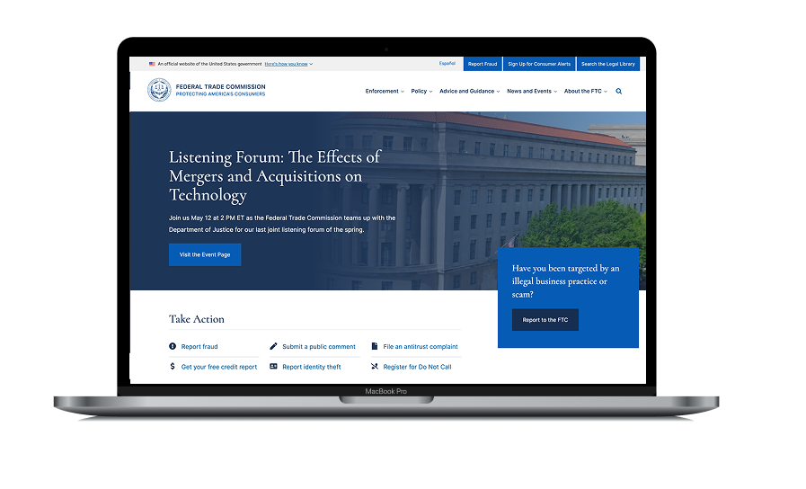
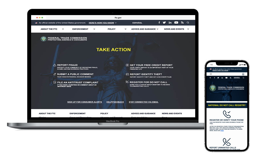
Consumers rely on the Federal Trade Commission (FTC) to access essential services such as the National Do Not Call Registry, fraud reporting, identity theft reporting, and free credit reports. However, the existing website presents usability challenges that make these resources difficult to discover and navigate. For users frustrated by persistent telemarketing calls, registering for the National Do Not Call Registry should be a quick and intuitive process.
HEURISTIC EVALUATION
Since the FTC website is an active public service platform, the redesign process began with a heuristic evaluation of the existing experience. Using Nielsen's usability heuristics and a UX evaluation checklist, I assessed the website to identify usability issues, accessibility barriers, and opportunities for improvement.
To document the findings, I created redlined annotations of key pages, highlighting areas where the interface did not align with usability best practices. These annotations identified issues related to navigation, content organization, visual hierarchy, consistency, error prevention, and user control, providing clear opportunities for design improvements.
SOLUTION
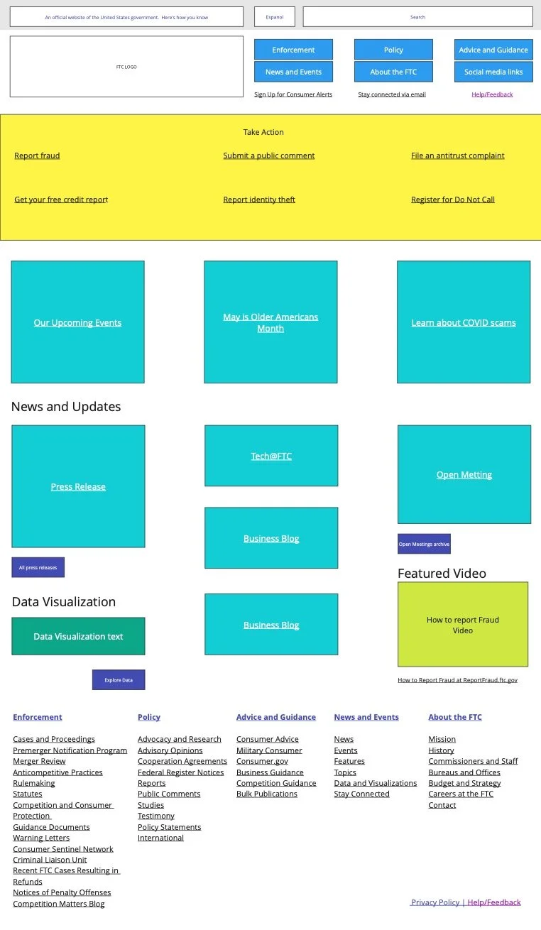
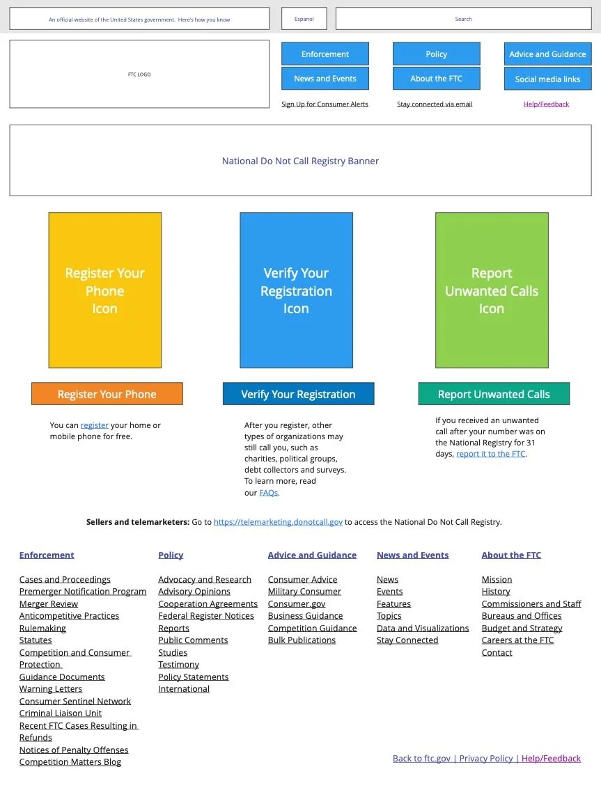
Redesigned the FTC website and designed a companion mobile app to create a more intuitive, accessible, and user-centered experience. The redesign focused on simplifying navigation, improving information architecture, and making the agency's most frequently used services easy to find and complete.
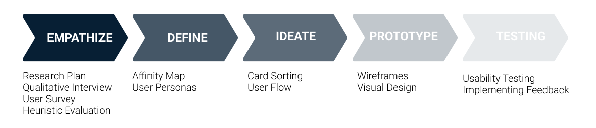
DESIGN PROCESS


HEURISTIC EVALUATION ON WEBSITE NAVIGATION
Effective navigation is essential to helping users locate information quickly and complete tasks with confidence. Because the FTC website provides access to critical consumer services, I conducted a focused heuristic evaluation of its navigation to assess how easily users could find and access key resources.
The heuristic evaluation of the FTC website's navigation identified several usability issues that impacted clarity and discoverability:
Redundant search functionality created confusion by presenting multiple search options with overlapping purposes.
Primary navigation lacked visual hierarchy, making it difficult for users to distinguish the most important actions. Top-level navigation buttons shared the same size, color, and visual weight, reducing scannability.
Low-quality logo diminished the site's visual credibility and brand recognition.
Limited emphasis on the FTC brand name made it less noticeable, weakening the site's identity and trustworthiness.
Recommendations
Based on these findings, I proposed the following improvements:
Establish a stronger visual hierarchy to better guide users' attention to primary navigation and key actions.
Eliminate the redundant "Search the Legal Library" field to simplify the search experience.
Replace the existing logo with a higher-resolution version to improve brand presentation and credibility.
Increase the prominence of the Federal Trade Commission name and branding to reinforce trust and improve recognition.
Differentiate primary navigation items through visual cues such as size, color, spacing, and typography to make important actions easier to identify.
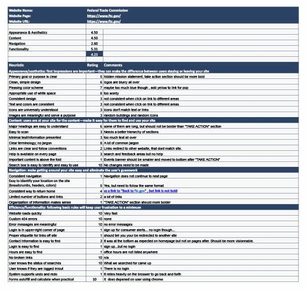
HEURISTIC CHECKLIST
Following the heuristic evaluation, I completed a heuristic checklist to systematically assess the FTC website against Jakob Nielsen's 10 Usability Heuristics. The findings from the checklist validated the insights gathered during the heuristic evaluation and established a clear set of usability recommendations. These insights directly informed design decisions throughout the redesign, resulting in a more intuitive, accessible, and user-centered experience.
ACCESSIBILITY TESTING
Following the heuristic evaluation, I conducted an accessibility assessment of the existing FTC website to evaluate how well it served users with diverse abilities and complied with Web Content Accessibility Guidelines (WCAG).
The assessment revealed several opportunities to improve the user experience by addressing visual, navigational, and compatibility issues. These findings informed the redesign, resulting in a more inclusive interface that reduces barriers, supports assistive technologies, and creates a more accessible experience for all users.

USABILITY TESTING
Following the heuristic evaluation and accessibility assessment, a usability testing was conducted to gather real user feedback before beginning the redesign.
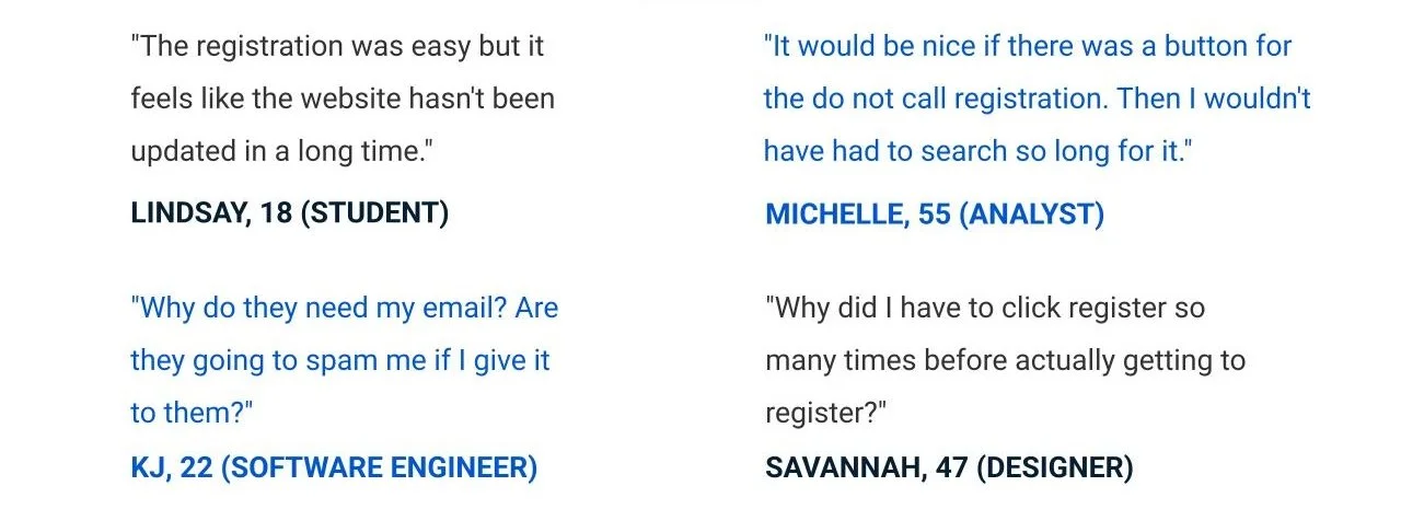
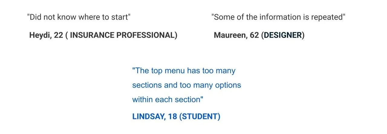
Participants completed two task-based exercises: the first required them to follow a defined user journey to complete a key task, while the second focused specifically on navigation of the FTC website. Each interview was recorded to capture user behaviors, observations, and feedback. Key quotes and recurring pain points were documented to provide qualitative insights, while patterns and findings were synthesized into a 2×2 matrix to prioritize usability issues based on their frequency and impact. The results validated the findings from the heuristic evaluation and accessibility review, while uncovering additional user needs and pain points. These insights directly informed the redesign, ensuring design decisions were grounded in real user behavior rather than assumptions.
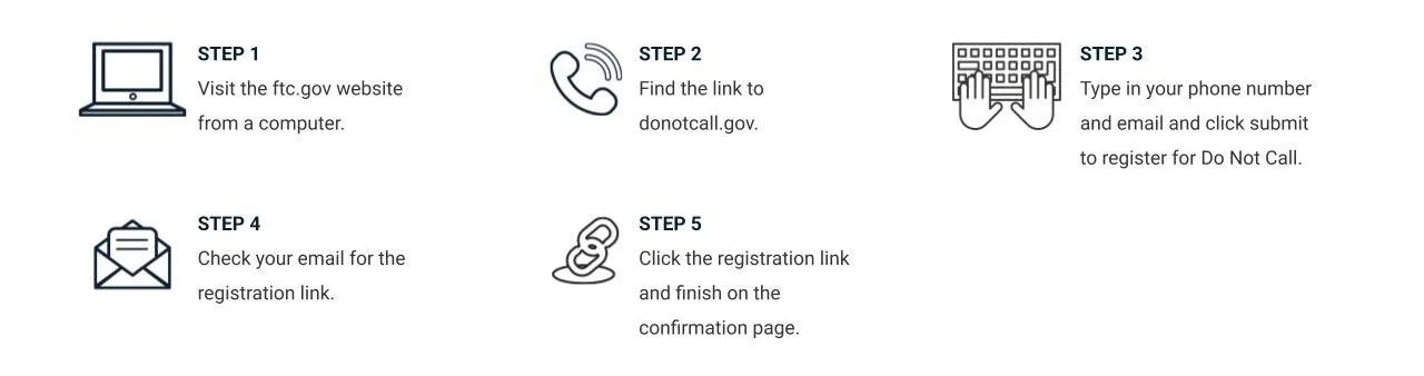
DEFINED USER PATH
The diagram below illustrates the end-to-end user flow for registering on the National Do Not Call Registry through the FTC website. It maps each step of the user's journey—from the initial entry point to successful registration—highlighting every screen, interaction, and decision along the way.
Creating this user flow provided a clear understanding of the existing experience, helping identify unnecessary steps, decision points, and areas of friction. These insights informed the redesign by streamlining the registration process, simplifying navigation, and creating a more intuitive path for users to complete their primary goal.
KEY QUOTES IN-SIGHT ON DEFINED USER PATH
KEY QUOTES IN-SIGHT ON NAVIGATION
2X2 MATRIX

CARD SORTING
Next, I used card sorting to evaluate how information was grouped and categorized within the existing FTC website. This research method helped identify opportunities to reorganize content in a way that better aligned with users' expectations and mental models.
Following the card sorting exercise and redline analysis of the existing site, I used the research findings to reorganize the current content and establish a clearer information architecture. This provided a stronger foundation for structuring the site's navigation, content, and key services.
The resulting information architecture helped define the overall direction of the website redesign and companion mobile app.
CARD SORTING (ORIGINAL FTC WEBSITE)

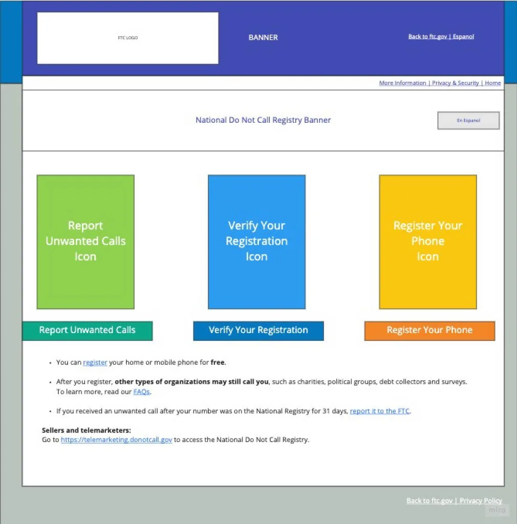
CARD SORTING (REDESIGN WEBSITE STRUCTURE)
BACK TO TOP