UX/UI CASE STUDY : THE SHOT REDESIGN
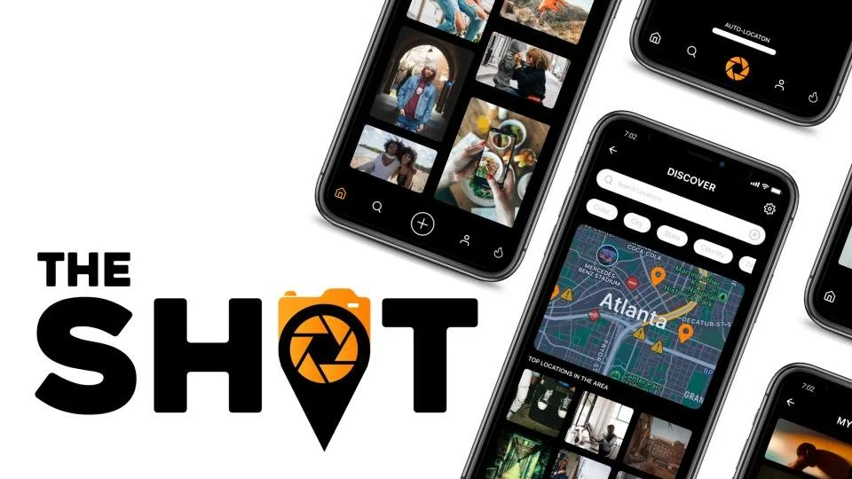
The-Shot is a location-scouting platform designed for content creators, photographers, models, and photo enthusiasts. It centralizes unique and inspiring shoot locations—whether for professional work or casual exploration—using GPS technology to help users discover hidden gems they might never have found otherwise.
PROJECT OVERVIEW
PROJECT SCOPE
Redesign of APP
TOOLS
Figma, Adobe Illustrator, GitHub, Google Drive, and Google Analytics
ROLE
UX Designer (Research, Visual Design, Interaction Design, User Testing)
TEAM
Joi Addison, Jada Robinson, Khadijat Ogundimu, Kandace Richards, with feedback from the mentor and peers.
DURATION
3 Weeks

DESIGN PROCESS
PROBLEM
The core purpose of the app is to help users effortlessly discover shoot locations using GPS coordinates. However, the existing interface and overall user experience required significant enhancement to make the process more intuitive, visually engaging, and user-friendly.
RESEARCH
Research provides a deep understanding of users—not just their immediate pain points, but also their goals, motivations, fears, and limitations. This foundational knowledge is key to designing thoughtful, effective solutions.
We kicked off our research phase by gaining buy-in from the app’s developer, K.J. Ogundimu. He highlighted major concerns, including the absence of a clear business model and a rushed, unpolished UI. His input helped shape our direction moving forward.
To further inform our design decisions, we conducted a user survey and interviewed four potential users from diverse backgrounds and interests, ensuring a well-rounded perspective on user needs and expectations.
STAKEHOLDER INTERVIEW
SOLUTION
Redesigned the app to elevate its overall look and feel, introducing new features, interactive elements, and user guidance. The goal was to enhance the user experience while preserving the app’s original functionality and core purpose.

“The Shot was created to make space for photo enthusiast to centralize their ideas about great photoshoot locations”
FUSTURATIONS
“UI of it is very crude and rushed”
“My biggest frustration with the app’s that there isn’t a business model, there’s not a way to make money”
EXPECTIONS
Would like to see dark and light mode feature added.
Wants a continuation of post to the app’s photos.
USER INSIGHTS
Alongside our 4 user interviews, we launched a survey with 21 participants.
Survey & Interview Questions
What is your social media handle or name, and what is your age?
What is your gender identity? (Male, Female, Non-binary, Prefer not to say)
How many followers do you currently have?
Which social media platforms do you use?
What type of content do you typically create? (e.g., food, restaurant reviews, travel, fashion, lifestyle, events, etc.)
Which cities do you primarily create content in? Do you also film or shoot content while traveling?
What format(s) do you usually post? Photos, videos, or both?
How often do you post on social media? (Daily, weekly, monthly)
How large is your crew when filming or doing a photoshoot?
How do you find inspiration for your shoots or videos? What tools or resources do you use?
How much time do you typically spend searching for locations to film or take photos?
What is your process for scouting locations for photos or video shoots?
How does budget influence the locations you choose, and why?
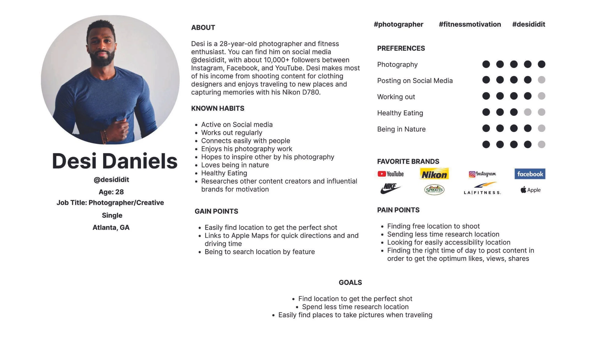
TRAVIS: A multifaceted social media user that uses Instagram, Snapchat, Twitter, and Facebook. 3900 followers. Key Insight: “An app to find locations would be super beneficial. “
BRYCE: An Instagram and TikTok Lifestyle content creator with 3,000+ followers. Key Insight: “Seeing other content creators keeps me motivated. It fuels me to look back at memories of pervious content that I have created and others.”
KIMBERLY: A lifestyle content creator on Instagram, YouTube, and TikTok. Has 5,000+ followers. Key Insight: “I’m inspired by things in the moment. If I setup a photoshoot then I tend to do more research. For the most part, I’m inspired by my surroundings - I see a place and think it would a cute picture.”
JOSEPH: A photographer and travel enthusiast who likes to use YouTube and Instagram with 3,000+ followers. Key Insight: “An app that finds location would be extremely useful. I spend 20 hours week looking for locations. I try not to use other people’s ideas like web pages and social media pages.
The key insight was clear — FINDING A LOCATION IS NOT AN EASY TASK!
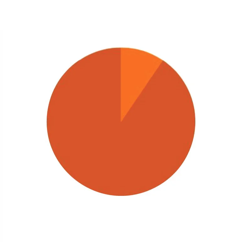
11 out of 21
participants said they struggle to locate the places they need.
76.5% of of 21 users enjoy making video and photos content.
85.7% Users use Instagram above other apps to post content.
Tools participants rely on when searching for locations:

90.5%
90.5%
of respondents reported needing to find a location for various purposes.

23.8%
photos & videos

57.1%
search engine

23.8%
Home design, diy & recipe ideas
Videos, music,& live streams
4.8%
navigation
4.8% - personal knowledge
Participant interest in an app providing precise GPS directions to scouted locations:
52% (11 participants) found the concept useful
19% (4 participants) were neutral but open to trying it
29% (6 participants) did not find it useful
The majority of participants (85.7%) report spending no more than an hour scouting a location, suggesting that most users aim for efficiency. A smaller group (14.3%) spends 2–3 hours, highlighting varied needs and workflows.
71.4% participants noted that distance does affect how they scout for locations.
OTHER KEY INSIGHTS INTERVIEWS AND SURVEYS
Location Search Time
Finding the location should be easy.
Users won’t spend extra time figuring out untagged locations.
Search time can range from 20 minutes to an hour.
Features Needed
A place to store content with full rights and clear sharing/privacy options.
Preference for knowing whether a space is private or public.
Interest in how many people have already taken photos at that location.
Best time of day for taking pictures.
Typical weather conditions for the time they plan to shoot.
Accessibility & Comfort
Need to know how crowded the location is.
Concern about surroundings and comfort when taking photos.
Safety is a priority.
Prefer public, accessible locations that aren’t highly congested with foot traffic.
USER PERSONA
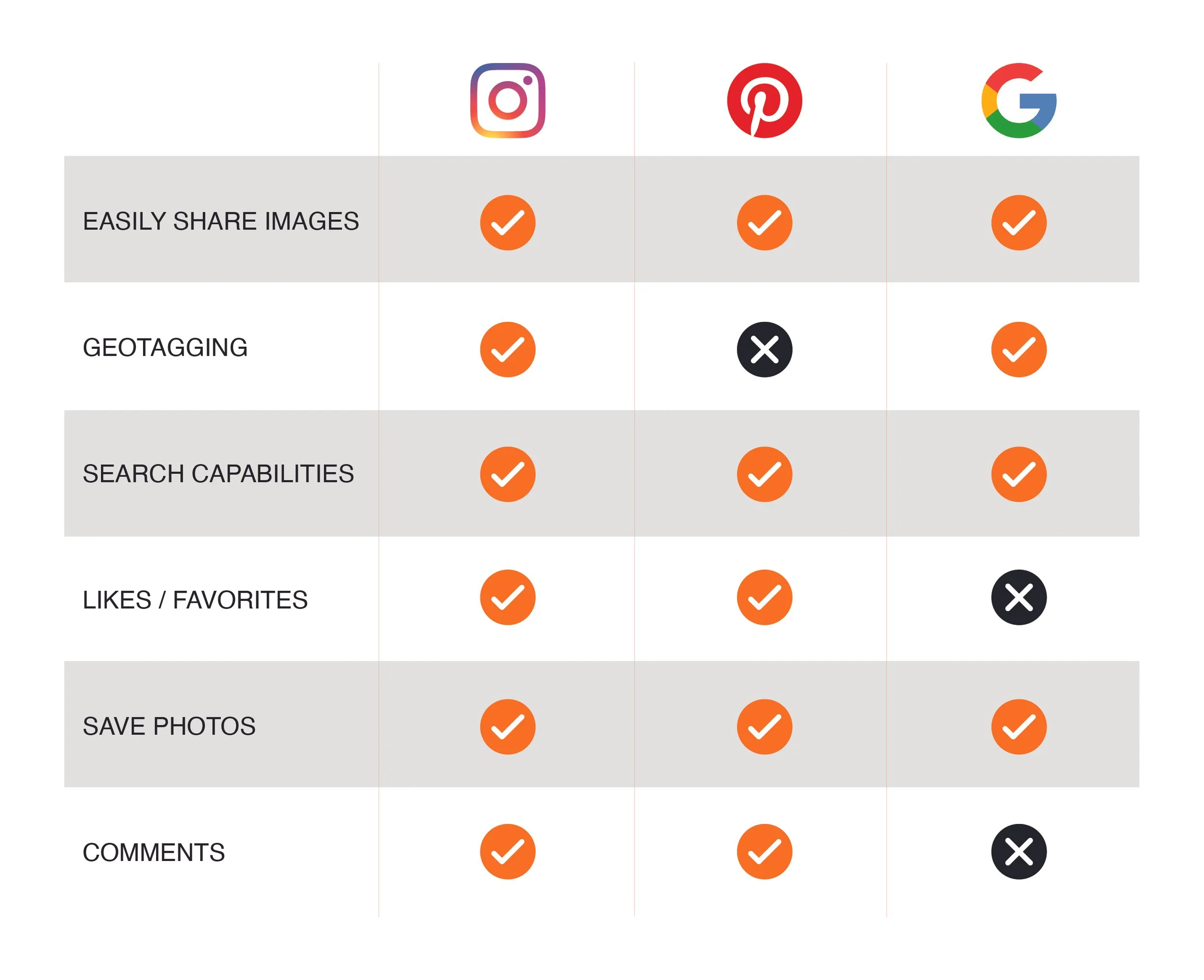
COMPETITOR ANALYSIS
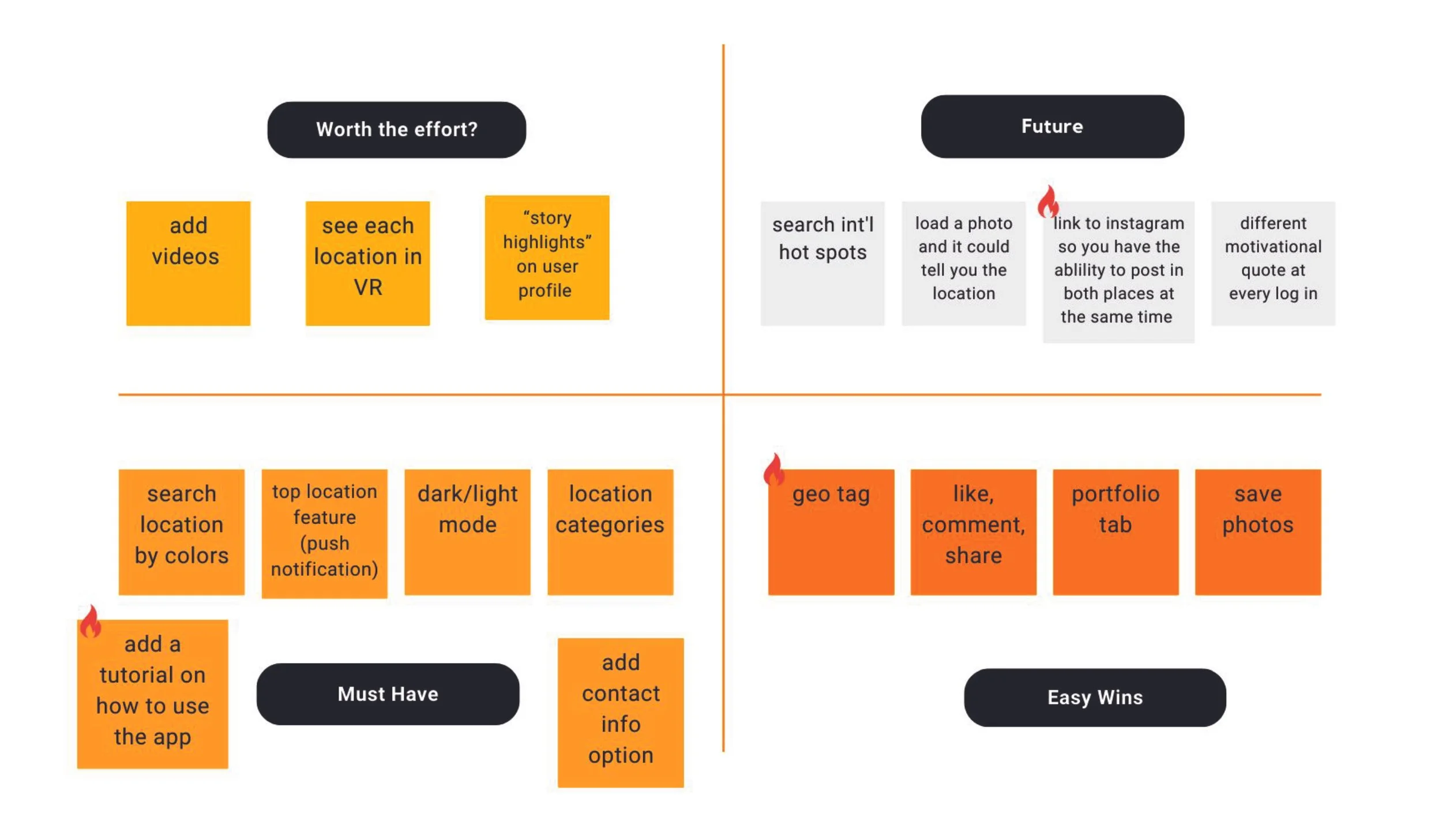
FEATURE PRIORITIZATION MATRIX
LOGO REDESIGN
The original logo for The Shot was visually too similar to the Instagram mark, creating brand confusion and limiting its distinctiveness in the marketplace. The objective of the redesign was to establish a clear visual departure while preserving core thematic elements important to the app’s identity.
The app’s creator wanted to remain within the visual language of photography and geolocation—specifically incorporating camera and location iconography— with orange as the primary brand color. Orange was intentionally selected for its associations with energy, enthusiasm, creativity, and warmth. As a hue that bridges the intensity of red and the optimism of yellow, it delivers strong visibility and approachability, making it highly effective for a dynamic, user-driven platform.Following the logo redesign, mid-fidelity wireframes were developed to align the app’s interface with the updated visual identity. These wireframes translated the new brand system into functional UI components, ensuring consistency across typography, color application, iconography, and layout structure.

MID FIDELITY PROTOTYPES
Following the logo redesign, mid-fidelity wireframes were developed to align the app’s interface with the updated visual identity. These wireframes translated the new brand system into functional UI components, ensuring consistency across typography, color application, iconography, and layout structure.
The mid-fidelity stage also served as a foundation for usability testing. Interactive flows were mapped to evaluate core features, navigation patterns, and overall functionality. This process allowed for early validation of design decisions and iterative refinement based on user feedback before progressing to high-fidelity prototypes.

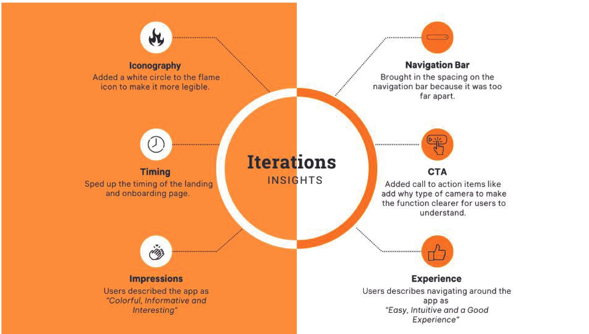
USER TESTING - ITERATIONS INSIGHTS
User testing conducted on the mid-fidelity wireframes revealed several key insights that informed the next iteration of the redesign. Findings indicated the need for clearer, more recognizable iconography, streamlined navigation, stronger call-to-action hierarchy, and enhanced image detail presentation.
These refinements focused on improving usability and visual clarity while reducing cognitive load. The goal was to create an interface that felt intuitive and familiar, allowing users to navigate seamlessly while maintaining alignment with the updated brand identity.